Creating the ultimate user experience.
Introducing Launch CU's newly developed website
After issuing a comprehensive Rebrand RFP in late 2013, Kennedy Space Center Federal Credit Union awarded this project to us in early 2014. After undergoing our “Building the Foundation” process, Kennedy Space Center FCU became Launch FCU in mid-2014, and in early 2015 we took their new website—reflective of this new brand—live.
By late 2019, it had been nearly five years since Launch last had a significant change in their website. And, let’s face it. That’s an eternity in the realm of web design. With monthly site visits surpassing 210,000 by late 2019, it was time for a comprehensive and strategic overhaul. Concurrently, the credit union had decided to transition from a federal to a state charter, which also entailed some serious strategic thinking.
Launch brought us in for both projects because they knew that in keeping with the credit union’s own tagline (also developed by us in 2014), we would indeed “Go Beyond” for them.
Start at launch pad
First, we tackled the name change to Launch Credit Union (dropping Federal) and the subsequent brand updates it entailed. By designing a “unique, but familiar” take on the original logo, the result is now a simplified, yet strong, variation of that original logo redesign. From this process, the direction the website redesign needed to go was made clear.
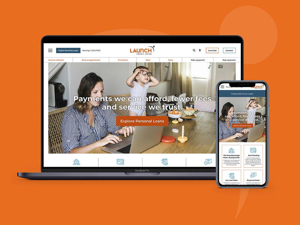
Where the old website had reinforced the brand in bright and bold ways, this redesign ushers in restraint—more white space and an airier design—while effectively expanding the design to be more device-inclusive, and highlighting its mobile responsiveness. It is, of course, fully ADA compliant.
Having hosted and managed their website these last five years, we also knew that most website updates are performed by Launch staff members, which meant making sure that the content management system was fully customized to meet their technical needs while not being overly complicated to use. Bottom line: The CMS needed to be robust, functional and intuitive.
A new name with new challenges
In addition to the new, eye-catching design, Raoust developed a strongly consistent new style guide that assists Launch staff members in ensuring posted assets will not be a distraction from the content, but instead, be an engaging, welcoming part of the design.
Visually, the new website incorporates increased use of icons, a simpler hamburger-based navigation system and an intuitive online banking form. We utilized a two-column block approach to page content management, with responsive elements, ensuring familiar design flow across desktop, tablet and mobile devices.
Our development team also worked hand-in-hand with Launch staff to develop and hone custom controls for call to action buttons, adding videos, creating custom content blocks, etc., without needing to program individual solutions for each new piece of functionality. Additionally, we designed a custom web skin for their new online loan application platform, which entailed working directly with their vendor to ensure asset management and stylesheets were consistently applied within the application.
After spending over a year understanding fully every objective Launch had for the new site, conducting additional research on our own to hone the scope of work, working through multiple design comps, developing the site itself, and refining the tools and the workflow for using them, the results speak for themselves.
Undertaking a charter name change (which also meant changing the domain name), a website redesign and relaunching both in the middle of a pandemic is a testament to the boldness of this credit union and their willingness to take risks in times of uncertainty. We are proud to have shepherded this process from the earliest days of concepting to the launch of the redesigned site itself...and beyond.
View the new Launch website