Let’s play the name game.

More than 100 years ago when credit unions were first established, it was easy to distinguish a bank from a cooperative institution. The words ‘credit union’ were plainly displayed in the name—job done—and if only things had evolved that simply over the decades. As credit unions grew in size and membership, the need to create a distinct identity became increasingly important.

Likewise, as the credit union industry continued to gain prominence and market share, the need to convey the words ‘credit union’ for some reason became less important. In most cases, they were abbreviated to just ‘CU’ and often with no more than a few additional letters before or after the ‘CU.’ Credit unions became acronym-crazy, and that’s not so great for consumers. Most people still don’t know what credit unions are and still do not understand that they can join. For example, a recent Zogo survey with Duke University students revealed that over 76% of students didn’t know what a credit union was.
To compound the issue, many credit unions also basically completely dropped their actual name along with their identity: JDCU and CUNJ come to mind, just to name a few. Acronyms R Us! Let’s be clear here: the JDCUs and CUNJs of this world ain’t Apple, McDonald’s, Mastercard or even the Artist formerly Known as Prince. Each of these brands is instantly recognizable from its symbol alone, achieving the kind of mass appeal and universal awareness most brand owners would give their right arm for. While these heavyweight champions of branding clearly deliver products and services many of us appreciate and enjoy, it’s their creativity and consistency in delivery that underpins their success. There’s a good reason why so few ‘nameless’ brands exist.
So, let’s talk CUNJ. Who is it, you may ask? Originally chartered by New Jersey Department of Transportation employees, CUNJ had no idea whether they had any name or brand equity. They just knew that their member acquisition initiatives were falling flat, along with deposit and loan growth. Extensive research uncovered a negative interpretation to their existing brand, including their preference to use CUNJ in virtually all of the marketing deliverables. Generic and bureaucratic, it was exacerbated by the lack of any value proposition. Oddly, none of these choices even began to showcase what a vibrant, retail-friendly financial institution the credit union really is. CUNJ desperately needed to rediscover itself.


Not rediscovery through a corporate-sounding, made-up word that would feel like an insurance carrier or pharmaceutical giant’s latest drug release. That sure isn’t the culture of this credit union. Besides, if your name is Credit Union of New Jersey, you own it, as there can only be one. That meant proudly championing the name, not an abbreviation, the whole name. We also focused on positioning it as a much larger financial institution—especially since they serve state and municipal employees statewide. That core constituency of employees also dictated the importance of doubling down on their name.
So, why is it important? The answer is simple: To succeed in our omnichannel world, your brand must flex between your physical environment, your digital presence and social platforms, as well as traditional communication channels. When you only have 0.5 seconds to attract consumer attention on Instagram, you need a brand that packs a punch. It’s this desire for instant recognition and an eagerness to deliver thumb-stopping moments that are driving clarity and focusing credit union brands on enhancing the distinctiveness of their value. Not defaulting to a faceless, anonymous institution with no name recognition.
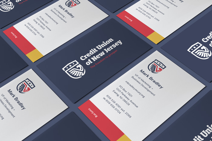
Since Credit Union of New Jersey’s new brand launch in Q3 of 2018, they have a renewed sense of their own identity, history and culture—one that also resoundingly resonates throughout their field of membership in an unvarnished and authentic way. The freedom to prosper, indeed!